
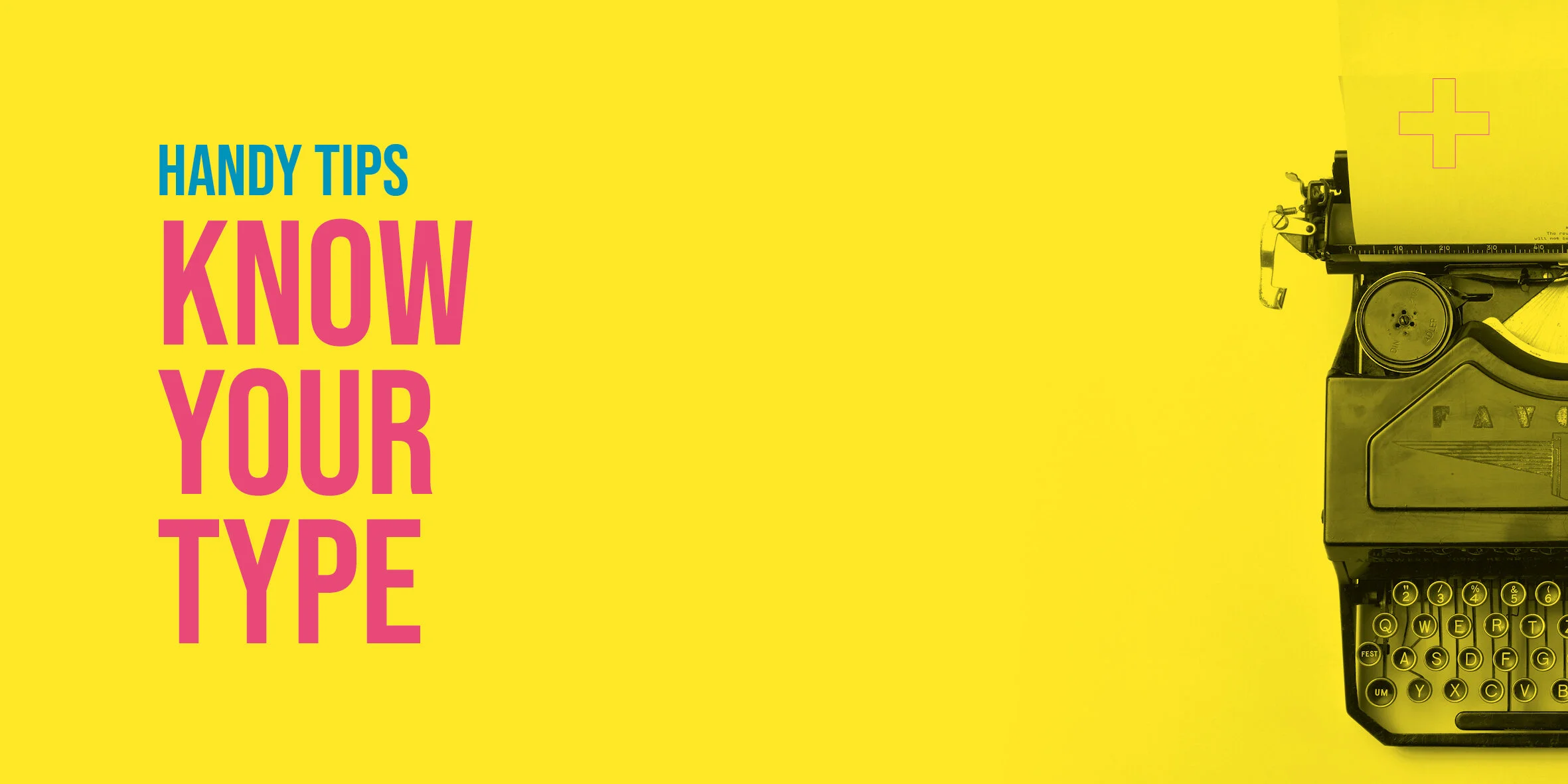
Know your type
The main categories of type
There are quite a few sub-categories but the main ones to remember are Serif, San Serif and Decorative. Serifs are the little ‘feet’ you see at the end of letters on fonts such as Times or Baskerville and these are usually credited with having a more traditional feel and are the most easy to read when in large sections of copy such as in books. San Serif fonts don’t have serifs, ‘sans’ is from the French word for ‘without’, and these fonts, such as Arial or Futura, tend to have a cleaner and more modern look. Most other fonts can be described as Decorative and can include anything from novelty fonts, futuristic or handwritten fonts.
Stick to 1 or 2 fonts
If you have an eye for design and feel confident that you have a good level of design ability, then feel free to use fonts that compliment each other. These can come from different categories for contrast but make sure they are different enough to keep it interesting and have obviously been chosen for their contrasting styles. If you’re not so confident then it’s a safer bet to stick to a single typeface and use different sizes and weights to achieve that same level of contrast.

Justify text to the left
In the West we read for left to right, so it makes sense to make it easier for the reader and justify text to the left. This is a basic rule that can be broken when you want to experiment or make a statement, but justified left is the safe option. Some people prefer to force justify the copy to avoid a ragged edge along the right hand side of the copy, but this can cause real problems with some lines looking squashed and others stretched out to fill the line, which is pretty horrible to look at and read.
Typographic hierarchy
Think about what content is important and give it levels of hierarchy by using different sizes and weights. The obvious one is to start with a large dominant heading. You can help readability further by using a sub-heading to elaborate on the main heading and provide a brief summary of what is in the content. Think about breaking up the content with things like captions, quotes or facts to break up the page further. Be careful not to overdo it though, the page can easily become a mess of different font styles and sizes. As a rule, start with a large heading at least twice the size of the sub-heading, up to four times larger can make it a feature on the page. The main content should then be at least a couple of font sizes or weights below the sub heading. If you break up the copy with captions, facts or highlighted information, try to keep this to one feature per page to avoid over complicating the look, the reader won’t know where to look if you overdo it. The best way to set the page is to think about how the type can be used to guide the readers eye. What do you want them to read first? Then think about how can you use different font sizes and weights to guide them through the article and keep their attention. People tend to scan content and prefer reading bitesize chunks of information to get an idea of what the article is all about. They will only read on if their attention has been grabbed. I’m guilty of this and I’m sure you are too!
Playing it safe
Here are a list of fonts that are pretty safe bets:
Avant Garde, Bebas, Bodoni, Clarendon, Franklin Gothic, Frutiger, Futura, Garamond, Gill Sans, Gilroy, Helvetica, Playfair, Poppins, Rockwell, Sabon, Trade Gothic.
I know everybody loves Comic Sans, but please don’t choose it, especially if you want to be taken seriously. If you really want a child friendly, fun font, here are some alternatives:

Let it breath
Type needs space. If you present copy crammed into a page with no hierarchy, tight line spacing where everything runs to the edge of the page then nobody is going to read it. You’re better off editing the copy or spreading it out over more pages.
Make sure the leading is spacious, this is the spacing between lines of copy. The default is usually 2 points more than the font size. For example 10pt font on 12pt leading. If you want a bit more space add a bit extra, but be careful about going more than 8 points different. FYI the type on my instagram post relating to this article is 12pt on 16pt. https://www.instagram.com/twoplusonedesign_/
Check for Widows (A paragraph-ending line that falls at the beginning of the following page or column, thus separated from the rest of the text.). and Orphans (A paragraph-opening line that appears by itself at the bottom of a page or column, thus separated from the rest of the text.) These need to be fixed by moving lines of text by eye. If you have design software there are tools to fix this automatically.
Summary
If you’re not confident with design and type in particular then play it safe by sticking to a single font, justifying it to the left, keeping it clear and always making sure there is a good contrast between your headings, sub headings and main content. If you feel a bit braver then bring out relevant bits of the copy such as quotes or facts to break up the content. By sticking to these basic rules you will produce clear, readable content. Once you’ve nailed that you can start breaking the rules. You rebel.